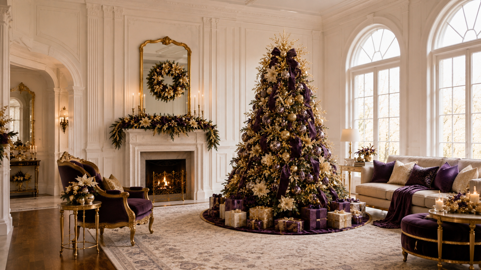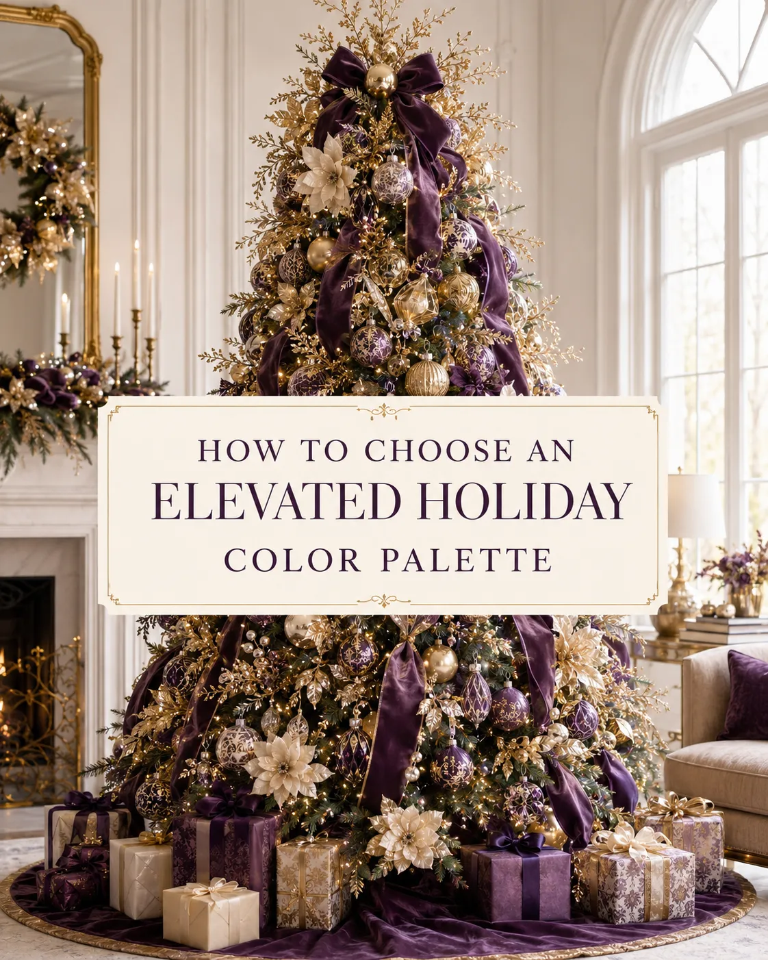
How to Choose an Elevated Holiday Color Palette
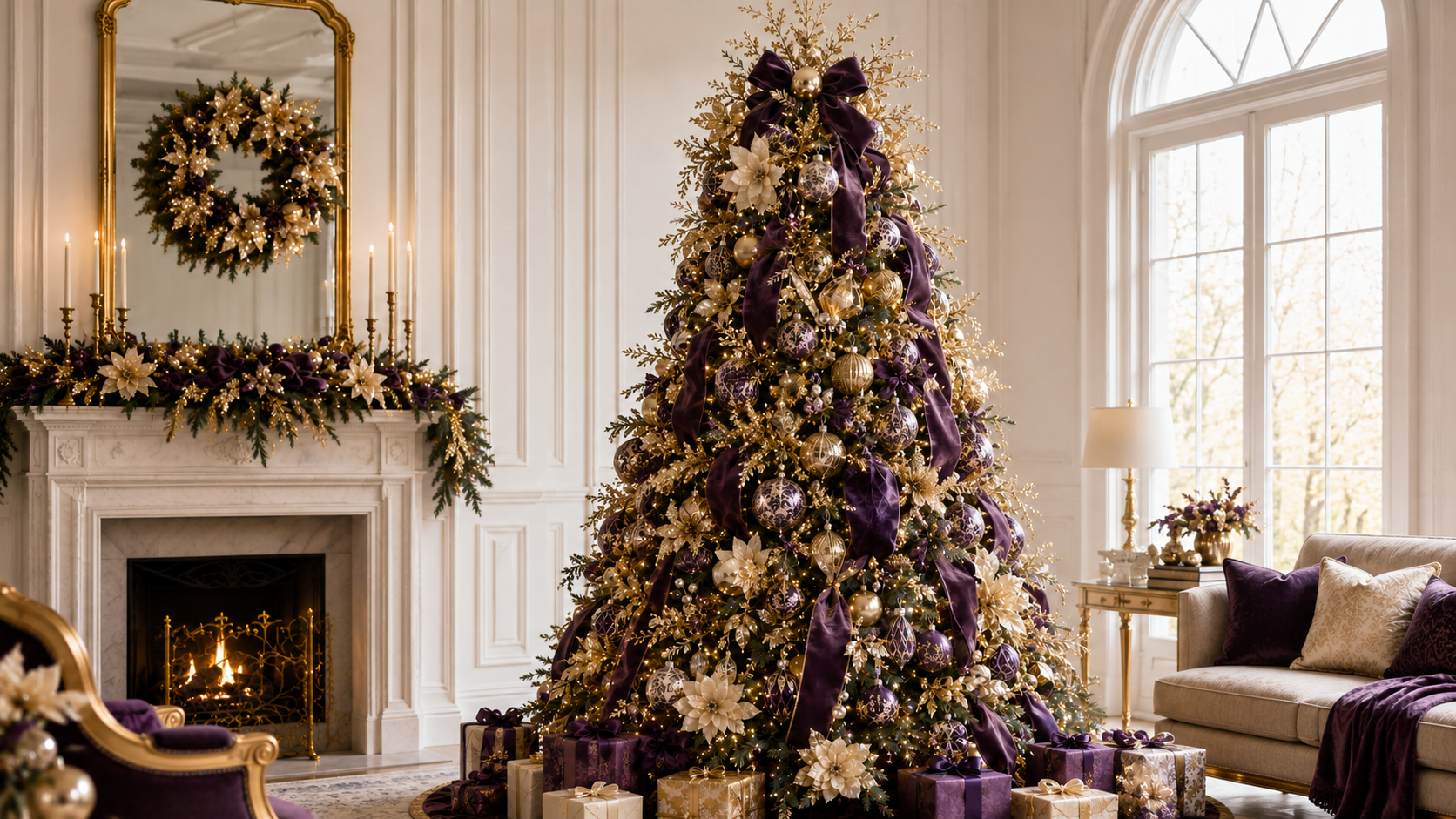
How to Choose an Elevated Holiday Color Palette
A Refined Approach to Choosing Holiday Colors That Feel Intentional, Polished, and Beautifully Connected
A sophisticated holiday palette is edited, not overloaded.
The most elevated holiday designs are rarely built from every color that feels festive. They are built from a palette that has been considered, refined, and repeated with intention.
Color is one of the first things people notice in holiday décor. It sets the mood before anyone sees the ribbon detail, ornament finish, or floral placement. But it is also one of the easiest places for a design to become too busy. Too many colors, too many metallics, or too many competing finishes can make even beautiful pieces feel disconnected.
At Chic Noel, color is never chosen at random. It is part of the larger design story.
It Starts With an Anchor Color
Every elevated holiday palette needs a place to begin.
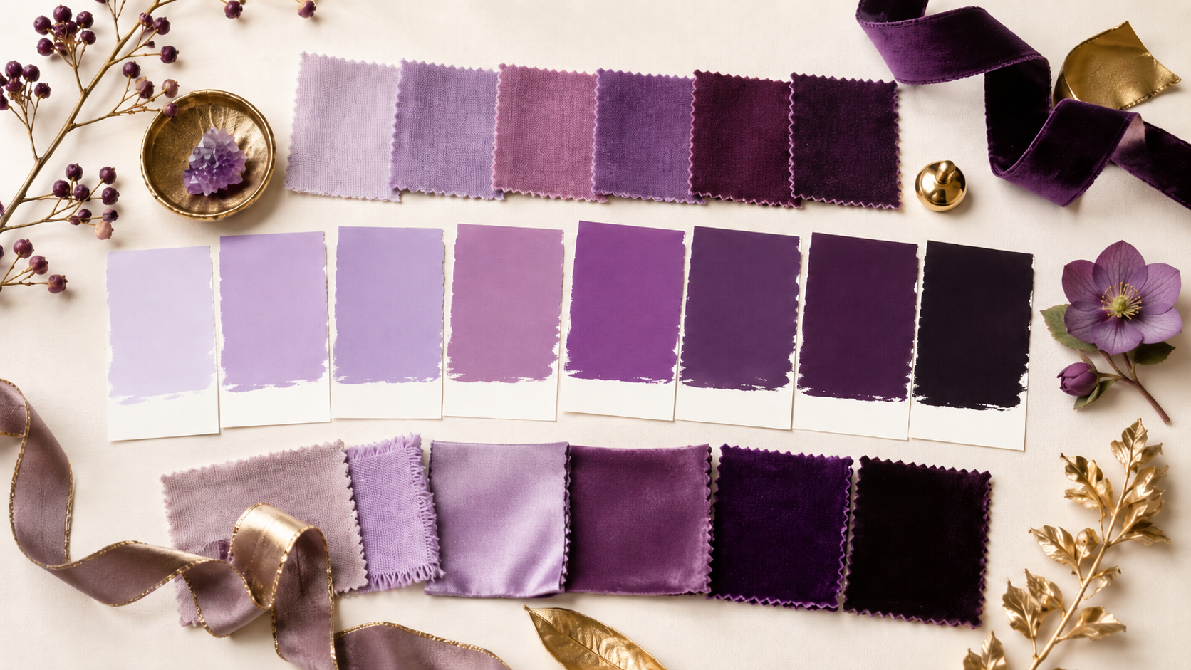
The anchor color is the shade that gives the design its foundation. It might be forest green, navy, cranberry, ivory, chocolate brown, champagne, or even a soft metallic tone. This color does not have to be the loudest color in the room, but it should be the one that grounds the design.
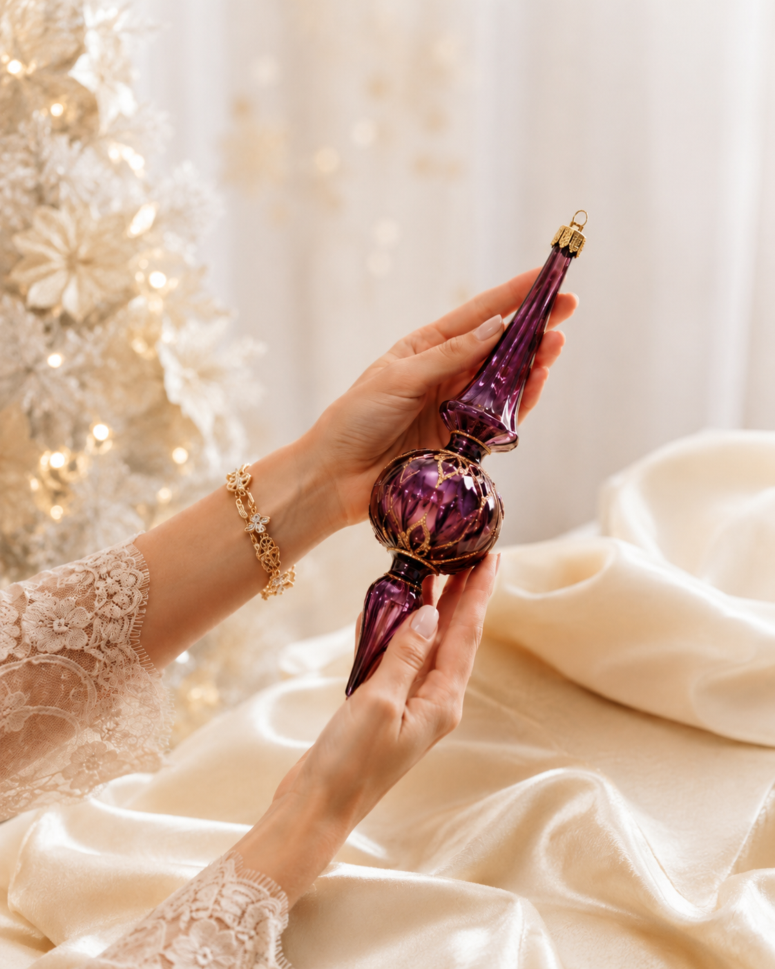
The best anchor colors usually feel connected to the space. A holiday design should work with the room’s walls, furnishings, flooring, artwork, lighting, and existing finishes. When the palette respects the space, the décor feels as though it belongs there instead of simply being added for the season.
Supporting Colors Create Depth
Once the anchor color is chosen, supporting tones can be layered in.
This is where the palette becomes more interesting. A green palette may feel softer with cream and warmer with gold. A blue and white palette may feel more dimensional with silver, pearl, or moss green. A traditional red palette may feel more elevated when the red is deepened to cranberry and paired with brass, black, or rich evergreen.
Supporting colors should not compete for attention. They should help the main palette feel fuller, richer, and more complete.
Metallics Should be Choosen with Care
Metallic finishes are an important part of holiday design, but they should not be treated as an afterthought.
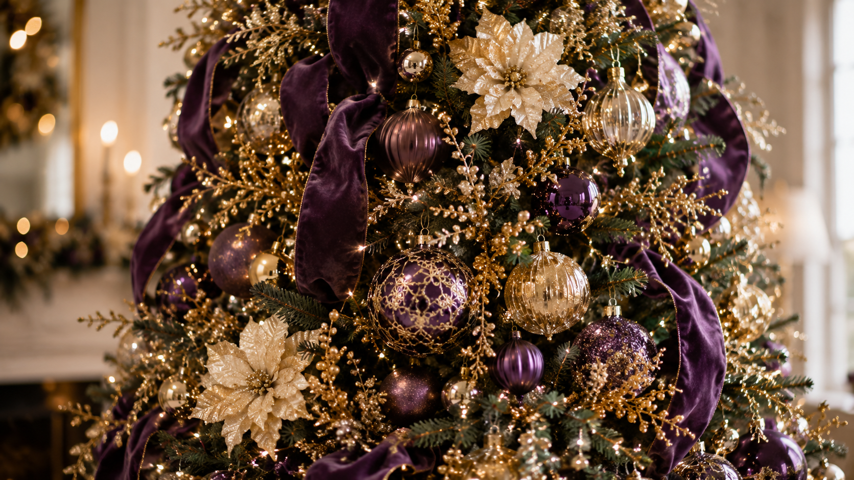
Gold, silver, champagne, platinum, bronze, brass, and mercury glass each create a different effect. Bright gold feels festive and warm. Champagne feels softer and more refined. Silver feels crisp. Bronze feels earthy. Mercury glass adds reflection and a sense of age.
Choosing one primary metallic finish helps the design feel more cohesive. Mixing metallics can be beautiful, but it works best when one finish leads and the others support it.
Texture Changes How Color Feels
A color palette is not only about color.
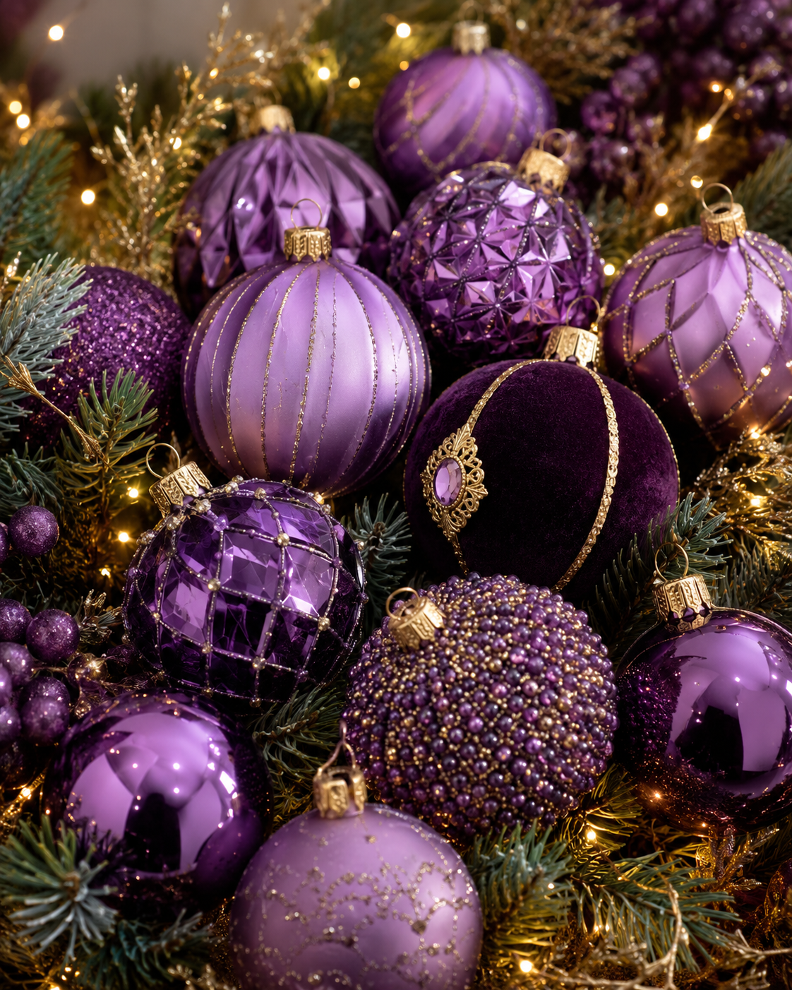
Texture can completely change the way a shade appears. A matte ornament, a shiny ornament, and a velvet ribbon in the same color will each read differently. Glass, pearl, satin, velvet, glitter, greenery, florals, and beaded details all add depth without necessarily adding more colors.
This is one of the reasons a restrained palette can still feel luxurious. The richness comes from layering finishes, not from adding every possible shade.
Repetition Makes the Palette Feel Designed
A color should appear more than once if it is meant to be part of the story.
The same tones should be repeated through ribbon, ornaments, florals, picks, garland, wreaths, wrapped gifts, tabletop accents, and smaller details throughout the room. When a color appears only once, it can feel accidental. When it is repeated with intention, the entire design begins to feel connected.
This is especially important when decorating more than one area of a home or business. The tree may be the focal point, but the palette should carry into the mantel, entry, staircase, dining table, reception desk, or accent pieces.
The Final Step is Editing
Before adding another color, it is worth asking whether the design really needs more color — or simply more depth.
Often, the answer is depth. A richer ribbon, a different ornament finish, a textured floral, or a more thoughtful metallic accent can make the palette feel complete without adding another competing shade.
An elevated holiday color palette does not have to be complicated.
It simply has to be intentional.
The most sophisticated palettes give each color a purpose. They allow the eye to rest. They create connection from one detail to the next.
Because beautiful holiday décor is not about using every festive option available.
It is about choosing the right ones.